Weekly Progress Update
Another busy week, but many progress updates to share! It’s very rewarding to see the bigger process unfold as I get closer to the finished product!
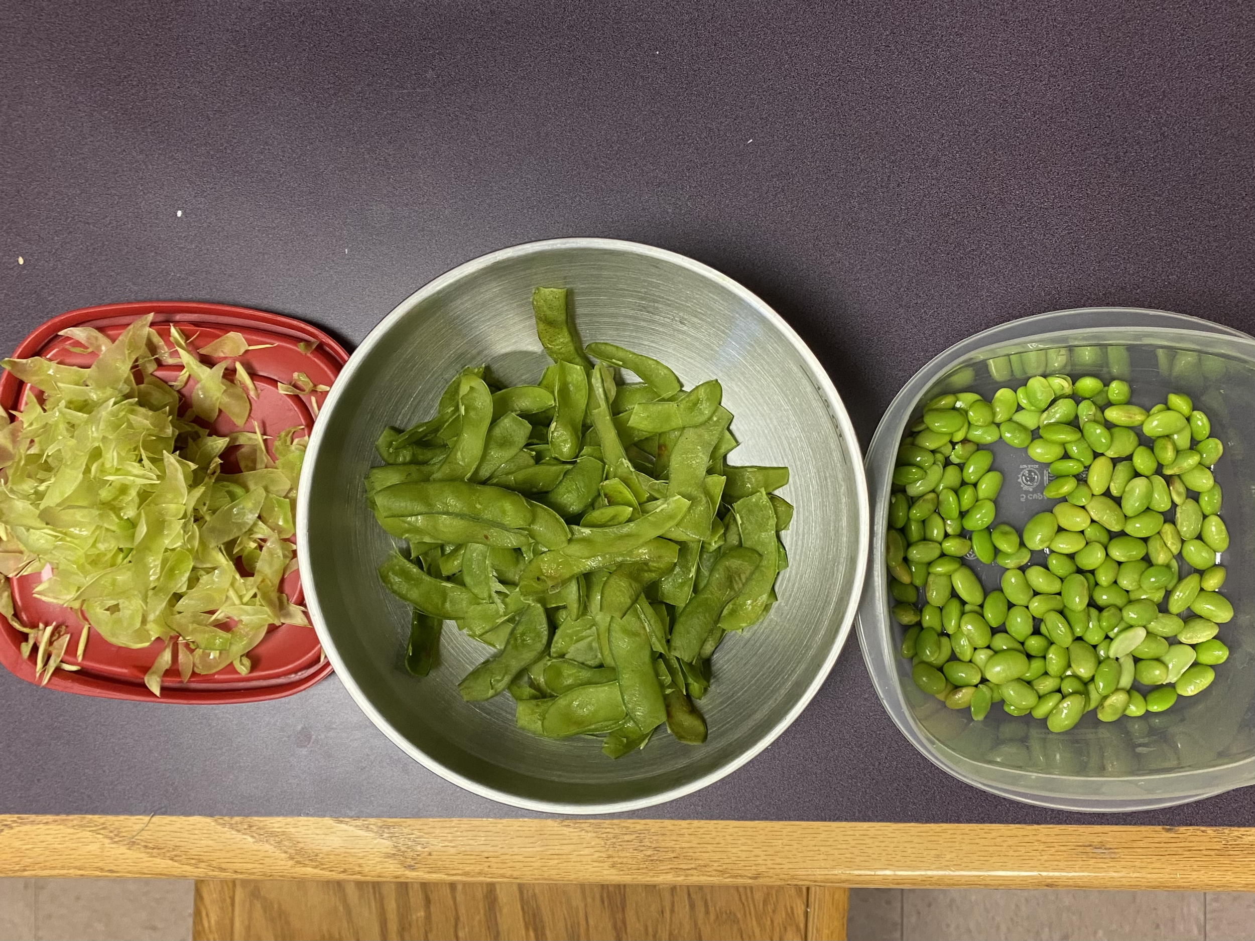
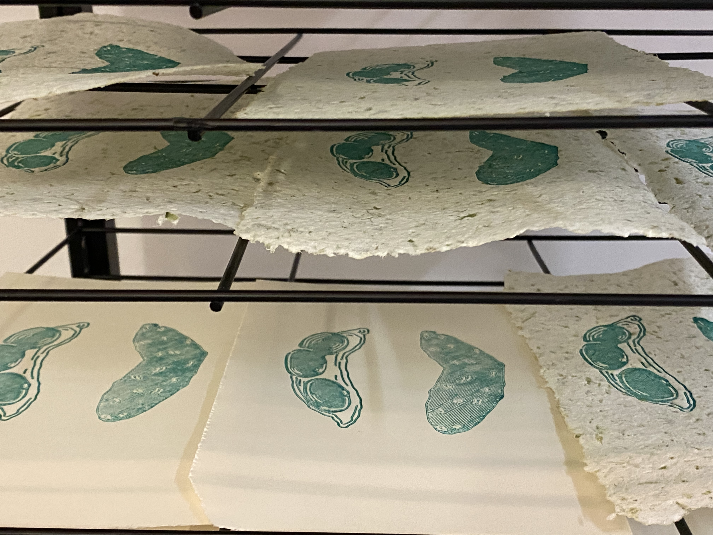
For one, I’m officially done 3D-printing AND printing the illustrations for Temple. On Friday, I dedicated at least an hour and a half to steaming edamame and separating the beans from their skins. While the process was…slimy, to say the least, it was good to just pop on a reality TV show and just get lost in the de-skinning process. However, not as easy as I thought it would be, as the skin has another inner layer that is thicker yet brittle. While no one who made edamame paper specifically stated that this other layer should be removed, I decided to do so because I felt it wouldn’t blend well and could clog the blades of the blender I was using. Which would prove to have been good intuition on my part, as the following day I made my edamame paper!
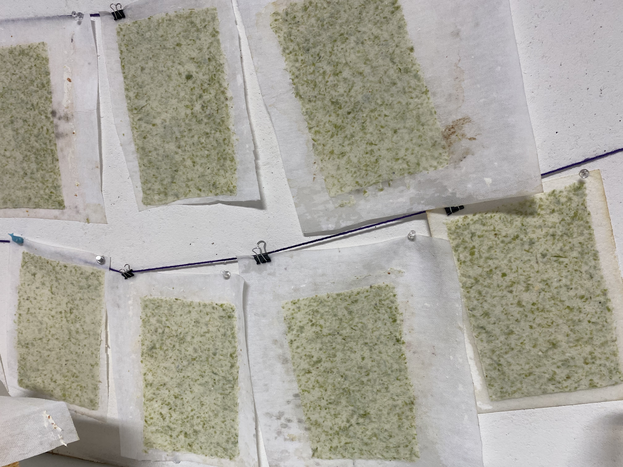
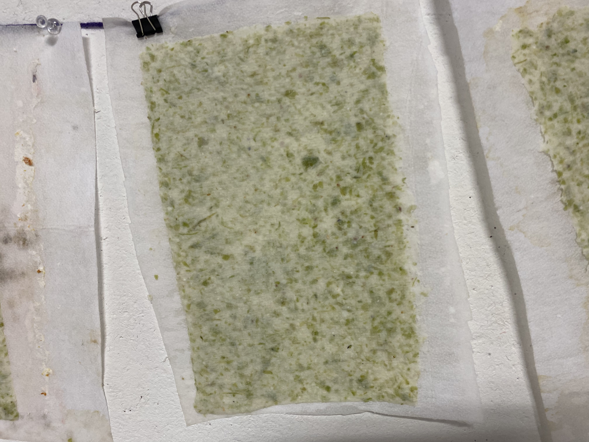
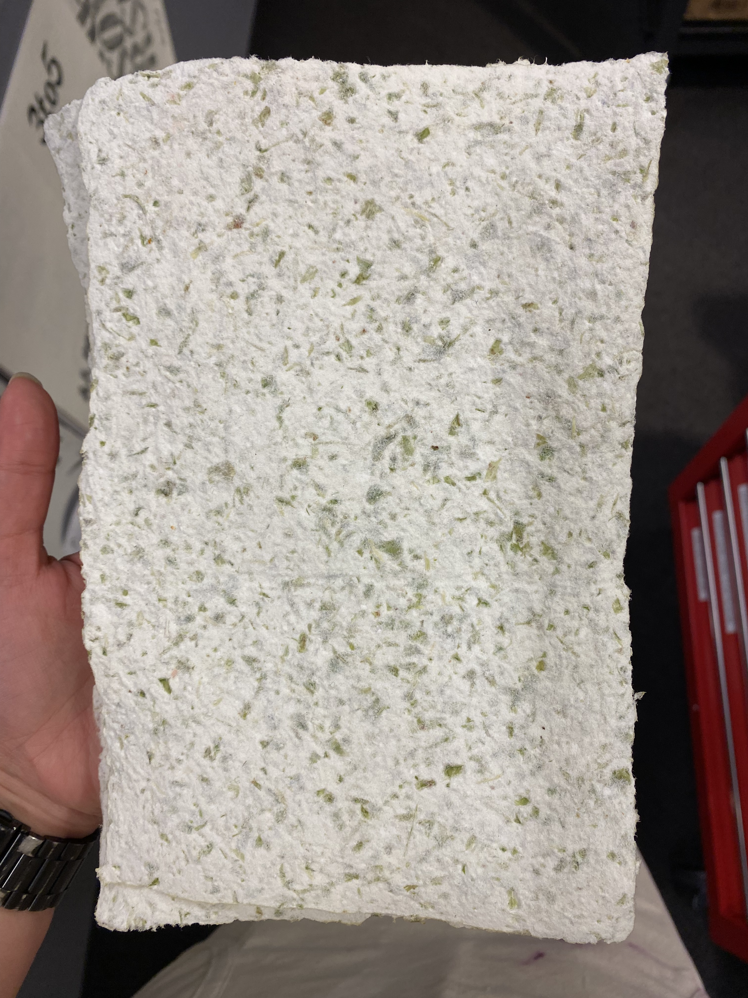
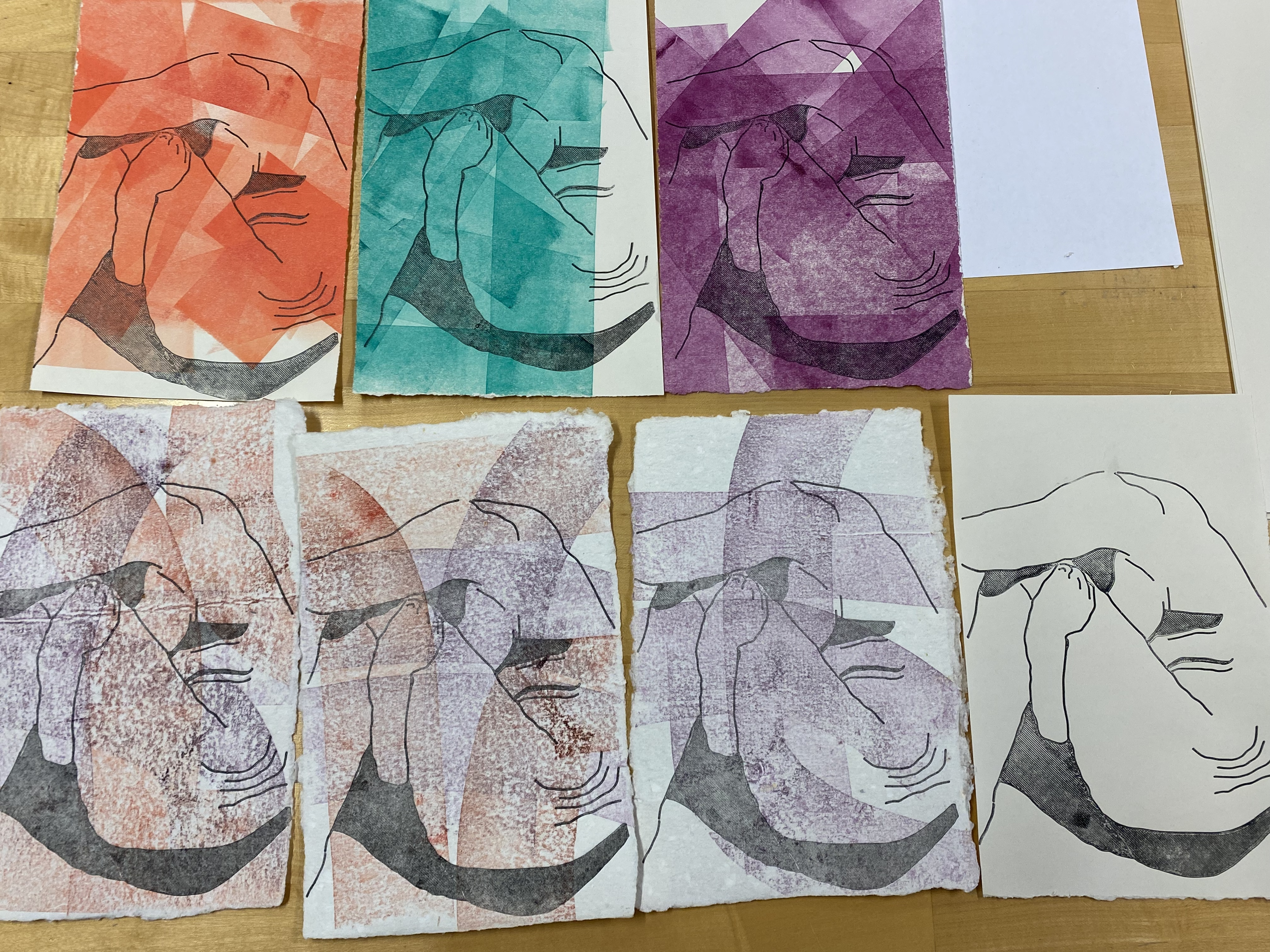
The papermaking process remained the same as the other attempts, blending and pulling, hanging, drying, and flattening them in the book press. It’s always interesting to see how the paper looks wet versus dry. When wet, the pigment in the fruit/vegetable scraps was really vibrant, but when dried, the BFK paper pulp mellowed the colors. The orange paper (wet) looked as if I dyed it with turmeric, and when the edamame paper was dried, it reminded me of tzatziki.
Jumping to Monday, that’s where I mostly made the biggest progress yet out of this entire week. In the morning, I was prepping the TinkerCad design for the front cover of Temple. Instead of doing the usual 4” x 6” base, I wanted the design to go off the edges of the paper and be stretched big. After measuring the paper, which was roughly 5.5” x 9”, the base for this 3D-print was 5.5” x 8”, leaving 1” for the title.
Later on Monday, I returned to the type studio to print the title covers on the Springhill Digital paper, where I rolled leftover ink on the paper and ripped it down to the size of the editions. While I was printing, my very last print was a 3D-printed version of the title page, the smallest plate, at 3” x 3.5”. Then, to finish the night, I printed the smallest print on top of some of the edamame prints!
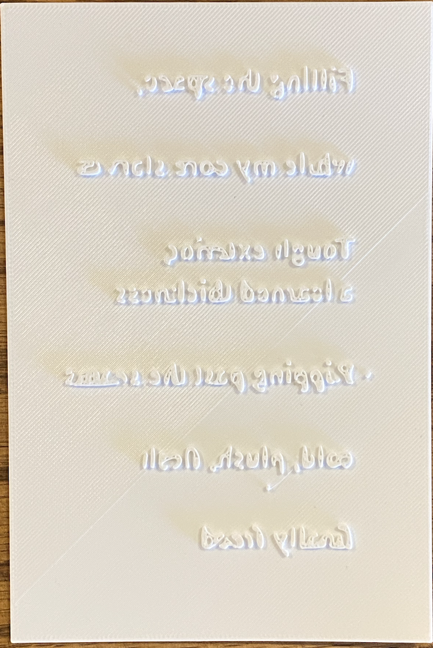
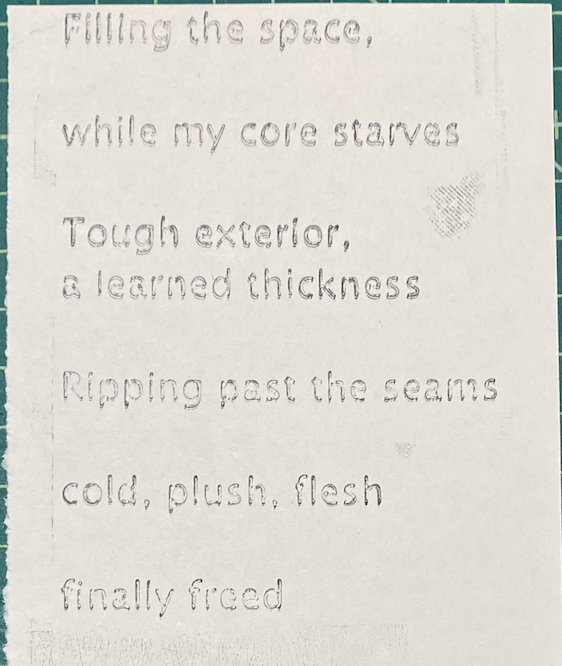
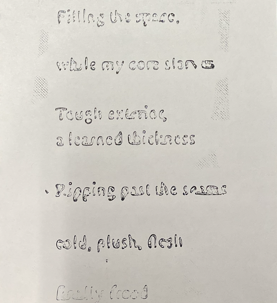
Wednesday and Thursday have been mostly experimenting with printing with text. Rafael has shown me some of his tests with text, with a poem of his for Emergent Digital Practices. However, since he was out of town for the week, I spent some time troubleshooting. For the first plate, I used Times New Roman, 12pt, on a 4” x 6” plate.
3D-printing it, however, the more I printed it, the more worried I got. When I was importing the .STL file from TinkerCad into PrusaSlicer, I noticed the text looked… weird. But I thought maybe the rendering itself wasn’t the bad, not the quality of the text. So I went ahead and printed it. Unfortunately, that wasn’t the case as when the print was done…I couldn’t help but giggle as it looks like gibberish. The more I examined it and showed it to some nearby professors, the more I decided to reprint it in a sans-serif font. With the print, I noticed that where the serifs, or the feet of the text, were in the text, it didn’t print, and those details either blended with the next word or fully disappeared.
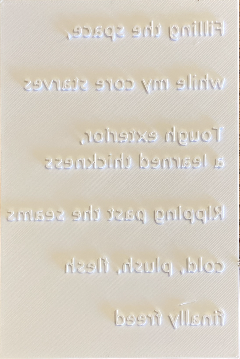
Just to test it out, I ran another 3D-print of the poem in Lucida Sans, a sans-serif font. From TinkerCad to the PrusaSlicer, I already saw a major difference in the text, as it looked more legible in the preview. Surprise, surprise… it printed 10x better. But I was still encouraged to prove both of them together to see the difference, and because everyone’s curiosity about the Times New Roman plate. So before I finished for the day, I did some proof prints.
Over the weekend, I’m hoping to complete the following before Tuesday:
Print text on illustration prints
3D-print the title, author, and colophon
Trim pages to be all the same size